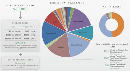
There was plenty of discussion on simplifying the US budget to household-sized numbers, and I have nothing to add, because I have zero interest in being an economist. 🙂 Here’s one more attempt at sharing some digestible information. An interesting site called Department of Numbers has collated numbers from government sources like the Treasury and put them together nicely into a series of charts. Here are two I wanted to point out and also save as a historical snapshot of “what things in 2011 looked like”.
US Government Debt as Percentage of GDP

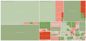
US Government Income and Expenses as Percentage of GDP

From the top chart, you can see that we are close to a 100% debt-to-GDP ratio. The last time it was this high was World War II. Even in recent “good times” – or at least better times than now – the percentage hasn’t really gone down much. That’s what I mean by “kicking the can down the road”. In the bottom chart, you can see the large gap between government revenue generated (taxes) and expenditures.
I’ll go back to saving 50%+ of my income now, hopefully investing it wisely, and not reading scary bedtime stories like Boomerang!

 This is how I did my extension last year. Just sign up with TaxACT and e-file your extension for free through them. It’s quick. It’s easy. You don’t even need to actually use them to file your taxes later, although TaxACT is also free for federal taxes with e-File included regardless of income, and is only $14.95 for state returns with free e-File.
 H&R Block contacted me to help give away six copies of their H&R Block At Home tax preparation software (formerly TaxCut). Specifically, you will get a free code for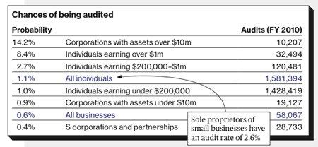
 The Best Credit Card Bonus Offers – 2026
 Big List of Free Stocks from Brokerage Apps
 Best Interest Rates on Cash - 2026
 Free Credit Scores x 3 + Free Credit Monitoring
 Best No Fee 0% APR Balance Transfer Offers
 Little-Known Cellular Data Plans That Can Save Big Money
 How To Haggle Your Cable or Direct TV Bill
 Big List of Free Consumer Data Reports (Credit, Rent, Work)